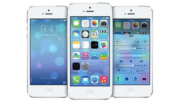
iOS 7 is out and here is guide to install iOS 7 on your iPhone. It's good that Apple brought flat icons but nothing is consistent now. You don't have to go through icons in detail, you will see the inconsistency in the gradients in some icons.
There are a lot of articles coming which are against the newly introduced interface. The good thing is that iOS 7 is still in beta, so we can expect Apple to change the icons and replace them with more consistent and meaningful icons.
If you see the original iOS 7 design, just like other people, it's more probable that you would not like the Mail App and Safari App icons. The gradient is just opposite on both, which is from top to down in Mail app, while it is down to top in Safari icon.
If you take your eye to the Game Center App, you will find the icon very irrelevant to the Game Center app. Those transparent bubbles overlapping each other doesn't relates to Gaming anywhere. Also, you will also notice that icons are filled with gradients from different sides, from top in some icons and from bottom in some.
The Camera app icon doesn't defines it, as we have the round icons and a camera with square shape doesn't makes it look good.
The clock app has got black background, so if you put on a dark wallpaper on your iPhone, you will find the clock app icon merged with your wallpaper.
Coming to the lockscreen, now you can swipe from top to get the notification center, which is pretty good. But if you look at the new lockscreen, the lock is totally changed and Apple introduced swipe up to unlock which is not as good as the lockscreen on previous versions of iOS. In previous versions, you just need to swipe from left to right which is simple and easy.
The new lock isn't cool and the area of touch, that is the arrow isn't bigger, so you may find yourself getting hard time swiping the arrow up sometimes. It would be great if Apple consider changing the unlock method.
Better iOS 7 Icons
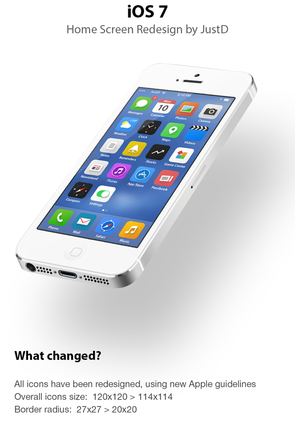
While going through the great community of graphic designers over Dribbble, Behance, Deviant Art, I at last found a concept that needs attention.
The concept is iOS 7 oriented, and the designer have changed nothing much except the icons, and the redesigned iOS 7 is looking far better and consistent to what the original one looks like. Flat Interface doesn't mean taking out the borders or shadows or something, flat interface is more of a consistency between the icons, it is to make the elements softer and blend with the background giving them no embossed effect.
![]()
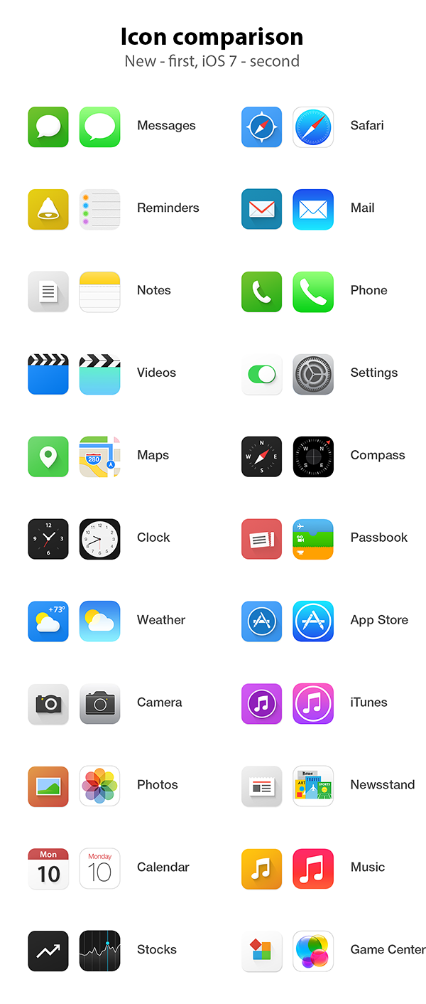
The redesign concept by Dmitry Kovalenko is close to perfect. The icons are much more improved and made more consistent by using shadows. The Game Center icon is much better, showing up the bricks along-with Apple's the colourful concept.
The music icon is good in both, the design and the one designed by Apple as the background is somewhat dark.
If you look at the mail and safari app icons, you will find them more better as there isn't any gradient apart from the shadow introduced by the Behance designer. This way, the flat interface is maintained keeping in mind the consistency in the icon designs.
But as I previously said, Apple still have a chance now to improve these things as iOS 7 is still in beta and will be released to public this fall. If we talk about the in-app interfaces, like the Photos app or the Camera app, Apple made them pretty well and simplified. The black and white combo is good and the typography is also made better.