Google is about to release Android 5.0 which will be named Key Lime Pie, here I am featuring preview of How Android 5.0 can look like.
Just as lot of concepts we were seeing before the release of iOS 7 which you can install now on your iPhone, we are seeing designers on the web showing up their interests in the upcoming Key Lime Pie version of Android.
Mockups are coming on Google+, Deviant Art and other sites where designers are showing up how the new update can look like. As much as rumours are upto, there will not be any major redesign, or complete overhaul. Key Lime Pie will be based on Jelly Bean design only with Introduction of some new features and minimal tweaks in the existing features and design.
Following the Holo User Interface in Ice Cream Sandwich and Jelly Bean, designers are coming up with their own concepts and mockups. And these concepts look so good that you would want to have same Interface on your phone too.
New Android 5.0 Concept
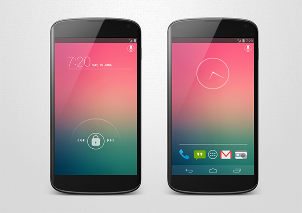
This one is brilliantly designed, with semi-transparent notification bar. The notification bar is same as in the Jelly Bean but the icons for battery and signal are gray. The lockscreen is very minimal, with beautiful clock on the top and Holo like lock icon which can be dragged right or left to unlock the screen.
This concept also uses flat icons which looks beautiful with the gradient wallpaper and the soft keys are also made transparent. I really liked the Google Search icon at the top, it's minimal and looks good. The clock widget is also redesigned, making the borders very thin.
Nexus 5 Design Concept
This is again a Nexus 5 and Android 5.0 concept by a Deviant, showing up the clock widgets which are minimally redesigned and flat icons. The Google search bar widget is also made cleaner and transparent with white border. White icons are used for clock and lockscreen, and the launcher looks like the stock Trebuchet launcher with just the icons changed.
The soft keys are made less wide and the apps like YouTube and Gmail are based on swipe, so you have to swipe from left to right to see the main navigation in apps. The camera app is pretty much the same as in Jelly Bean.
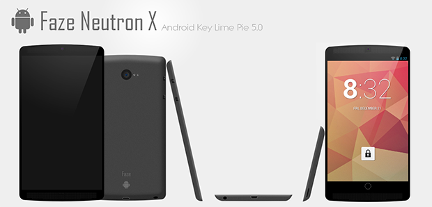
Faze Neutron X
Faze Neutron X is a 4.7 inch phone running on Android 5.0 Key Lime Pie, it's just a concept made by a user on Deviant Art. The phone looks close to Nexus 4 but is much wider and is very slim. The concept showcases the lockscreen with the traditional Jelly Bean clock widget and the squared lock.
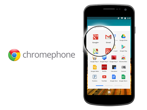
Chrome OS Phone
It is actually based on Google's Chromium OS, designed by Zach Alcorn. The concept showcases Flat icons which are looking pretty good. This is the most beautiful App Drawer I have ever seen, consisting of all the Official Google Apps, Chrome Web Store and apps for Google Docs and Spreadsheet too.
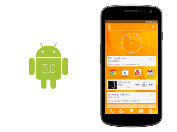
Google Now + Chrome OS Concept
Designed by a Deviant Art user, the concept combines up the Chrome OS and redesigned Google Now widget at the top of the home screen. The transparent status bar and Holo icons in the dock looks well.


