Twitter is one of the popular sites that aims to make communication easy. Twitter has got very simple design, and even if you look at the previous design, you will find that there's nothing much different apart from that that they moved the tweets timeline from the left column to the right column.
It is very less on the web that we get to see a complete design overhaul on such sites. Talking of Facebook's design, they moved from normal feeds to timeline now but there's actually not much difference overall, because users are getting the same experience.
Fred Nerby, a Graphic Designer from Melbourne have a concept that is completely different from what Twitter is. The concept focuses on flat interface, much like Windows 8 UI and minimalistic approach.

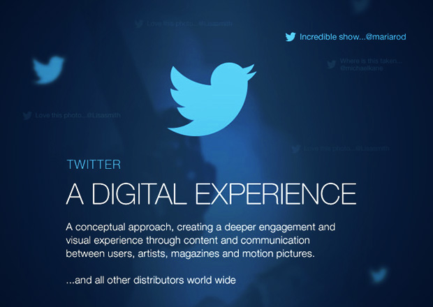
A Conceptual approach, creating deeper engagement and visual experience through content and communication between users, artist, magazine and motion pictures.
The visual interface looks incredible and different, and the concept is different too. The features like Tweet your Answer, Artists Talking to Other Artists, Latest Music by Artist, Horizontal Page Scrolling, Selected Artist Transition, Artist Conversation, Tweet to Infographics etc. are very modern and I doubt it is able to implement but it would be great if Twitter Team considers this design concept.


