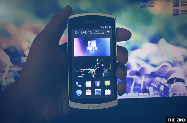
Since the release of Aviate Launcher, I was really excited to get the Invite Code for hands-on the launcher. I am using it for about a week now and it not only helps in launching apps, but it also adapts the surrounding and help you with your work.
Aviate is simple, clutter free launcher that changes with your surroundings. It is not for those who frequently switch between launchers for customizations. It is for those who want Intelligent and helping homescreen on their Android phones. The launcher is unique too and isn't based on the traditional launcher like in Atom Launcher or Google's stock launcher.

The Interface
Aviate comes with simple, clean interface which is a lot like Google Now Inspired user interface. Just like the cards functionality in Google Now, the home-screen is divided into 3 pages which can be accessed by simple left or right swipes. The 3 pages contains the main screen, the collections and the app drawer.
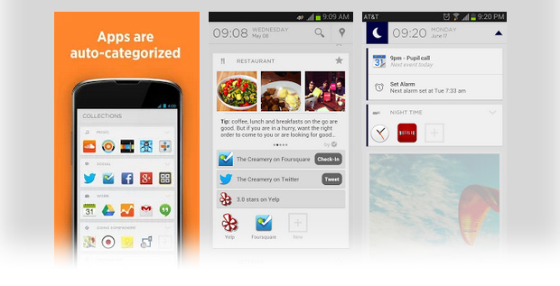
By swiping to the extreme left of the homescreen, you can access the Spaces. You can switch between Time, Work, Settings and Going Somewhere spaces. The main screen will change with spaces and will show you relevant information based on your Current space. The Spaces section also shows places Nearby you if you want to get directions. The app uses GPS to find nearby locations and list them in Spaces so that you can have a quick access to the places.
Switching between pages is smooth. Pressing the Home button on main screen will open up the information box (yes, this is what I call it) on the same screen at the top, while if you press the home button on a screen other than the main one, it will jump to the main screen.
Customization Options

I already mentioned above, this launcher is not for those who love customizations. This is for those who are professionals and who want to have an organized and quick homescreen on their phones.
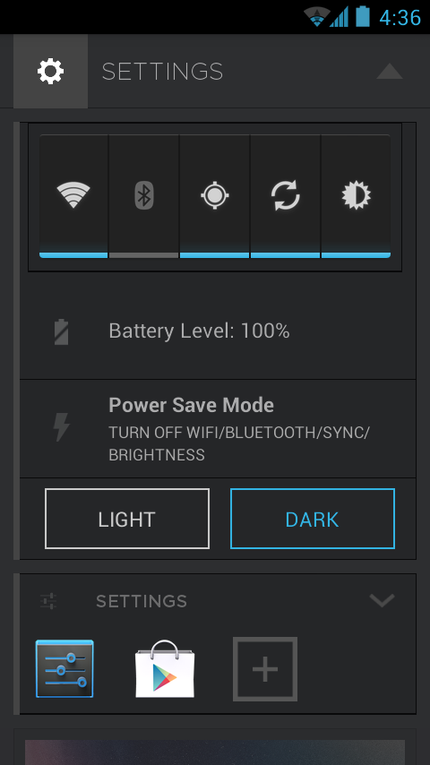
Aviate Launcher gives you less customization options. You can access the Settings from the Spaces. The Settings page shows a widget which can be used to toggle WiFi, Bluetooth, GPS, Sync and Brightness. It is actually the stock widget which comes with your phone.
Apart from the toggle widget, you also get a Battery Level indicator which displays the Battery Percentage. There is a Power Save Mode option just after the Battery Indicator, which allows you to enable and disable Power Saving Mode. Power Saving Mode disables WiFi, Bluetooth etc. to increase your phone's battery life.
Just after that comes my favorite option, the ability to switch between Light and Dark color schemes. The app default is Light, but you can switch to the dark color scheme. I personally like the dark color scheme more as it looks much better with light text.
You get no other option with the launcher. But I think the developers will be adding some more options as the current latest version of the launcher isn't stable.
Collections

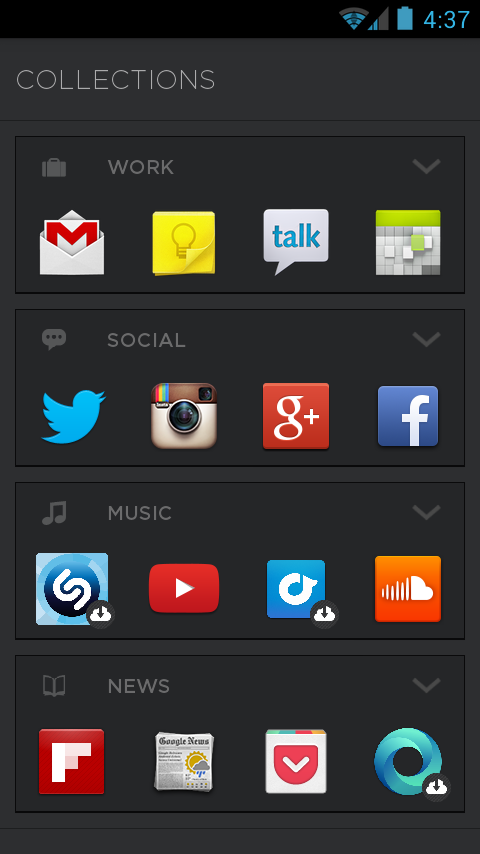
The collections screen contains applications in categorized form. Like you get a Social collection which includes social networking applications like Twitter, Facebook etc. Similarly, there is a Work Collection, which contains Gmail, Calendar etc.
You can also add custom applications in any of your collections. To do this, just move to the main app drawer screen and long press an app and move it to the collections screen. You can rearrange apps too within the collection just by long pressing the app icons.
Collections is a nice way of organizing apps. You can create custom collections and add desired apps into your collections. Each collection shows only four apps which are placed on the top , you can expand the collection by clicking on the down arrow at the top right of that collection.
All Apps
The app apps page is grid based and sorted alphabetically. You can quickly jump to apps which starts with a particular letter from the bar in the right.
This type of App Drawer is actually better than the App drawers we get in launchers like Apex, Nova or the Stock Launcher. I can launch apps quickly as the apps are categorized well. In other launchers, you get uncategorized apps and sometimes it is hard to find apps in the drawer.
The homescreen contains favorite apps with a limit of 8 apps. You can remove the default apps from the favorites and place custom apps. Apart from that, you get a widget in the main screen where you can place any photo from Gallery. You can also add widgets on the main screen.

Aviate impressed me and I will be using it for sometime. The launcher is good in performance too, it doesn't lags and the transitions are very smooth and fast. The app is currently invite-only and you can ask for invite here. The developers are currently working on the launcher and it will be released for public soon. I just hope the launcher will be outstanding with some more functionalities and options.