Microsoft is going to release Windows 8.1 next, so it will take a long time for Windows 9 update, but the concepts for the OS interface are already coming. The switch from Windows 7 to Windows 8 was huge in terms of design. The Metro Interface have got mixed opinions from users, while some of them like it, most of the users are happy with Windows 7. Microsoft also confirmed that Windows 8.1 will have the same design but with some small graphics improvements and tweaks.
I personally didn't like Windows 8, the combined Metro and Windows Apps isn't something I was expecting, there should be either only Metro Apps, or just the Windows apps. I just hope for design consistency and improvements in the future updates, and it would be great if they can consider this concept.
Start Screen
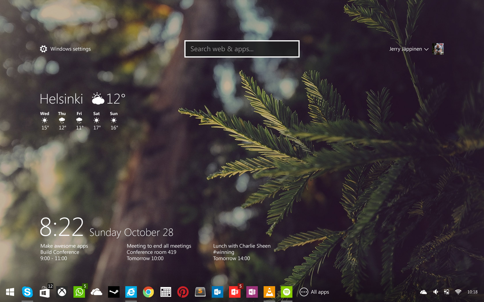
Local & Bing search. Transparent live tiles. Access to settings. Always accessible and visible in the window reel.
The main, Start screen is refreshing and very well crafted. The desktop features common information and shortcuts to the apps just as Mac's dock with transparent background, looks Uber cool.
Windows previews
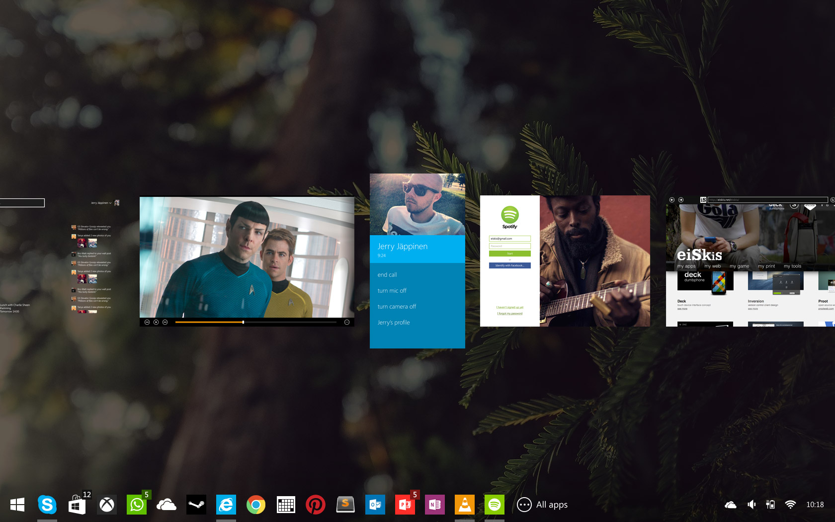
Full window previews instead of icons or tiles. Context and window order stay consistent. Natural interaction with touch, keyboard, mouse and even voice control.
The opened apps shortcut Alt + Tab shows the icons of the Apps and not the live preview, the concept suggests that there should be live previews.
All Apps
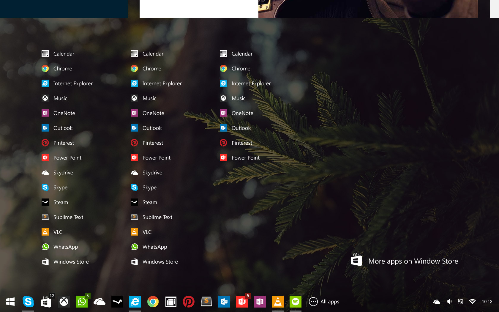
Easy access to an exhaustive list of installed, available applications. While pinned apps are customizable, all apps are shown in alphabetical order in a consistent manner.
No tiles, no big square, just simple and clean list of apps installed. Looks much better than original All Apps interface of Windows 8.
Smart Settings
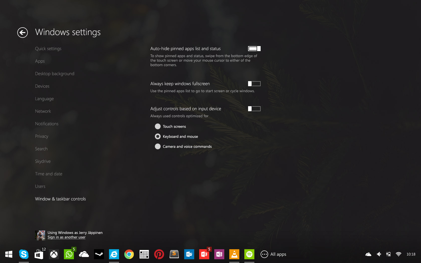
Windows 9 adapts to various input methods, but users can also adjust the behavior themselves. Regardless of whether you prefer traditional desktop usage or full-screen metro-style workflow, you'll feel at home.
Fully Functional Apps
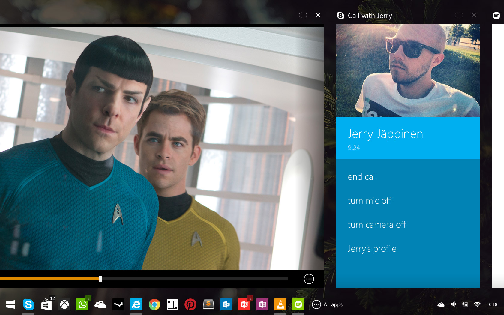
All traditional and metro Windows apps work seamlessly on Windows 9. Familiar window controls and rearrangement are available for users to give just the right amount of control.
Personalization
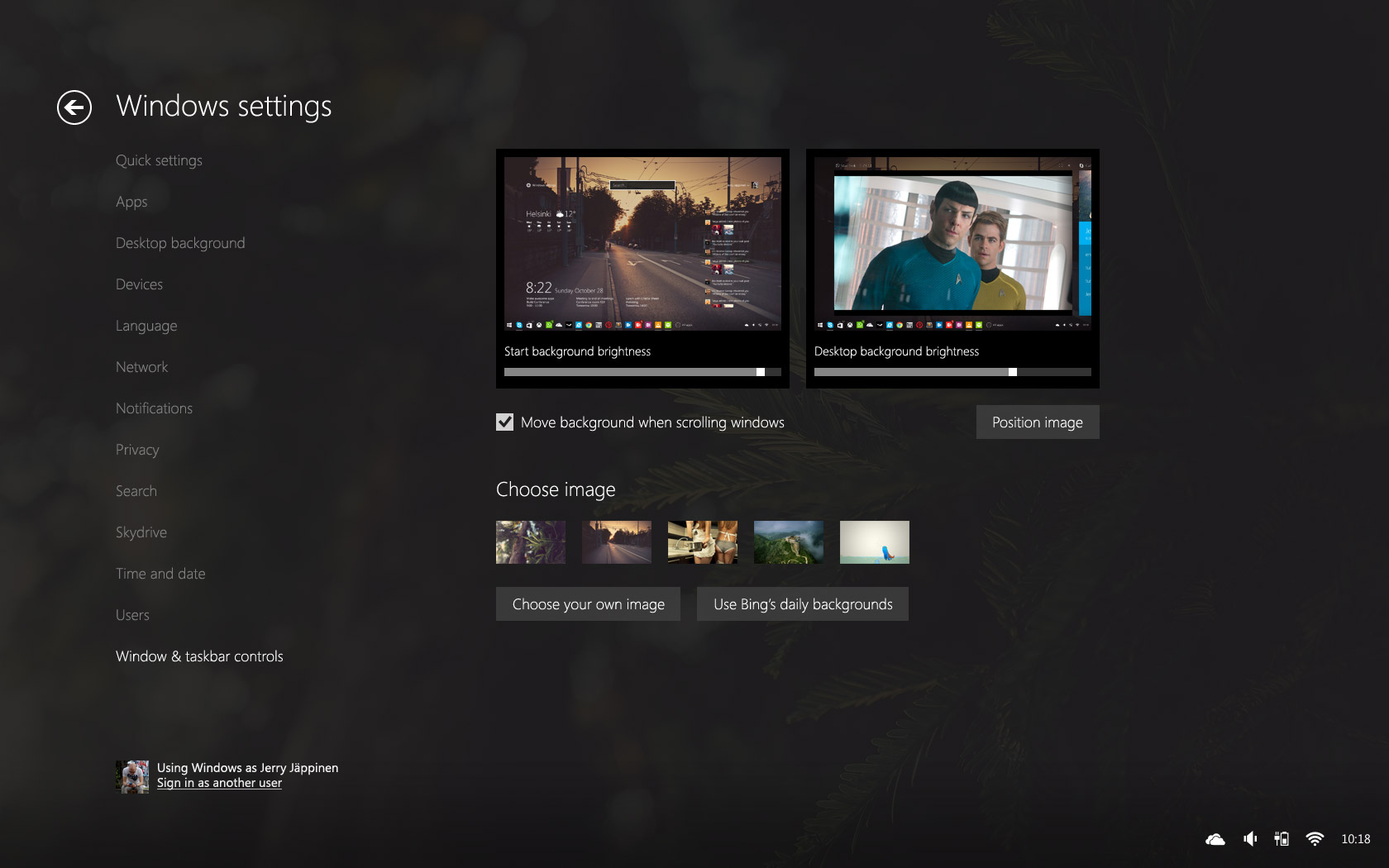
Users are given control over the desktop background that gives personality to the user experience.
The concept is really nice and practical. Most of the functionalities are inspired from the original interface of Windows 8, but design is much more consistent and clean in the concept. I really liked the way the idea of transparent app designs, like in Skype and Windows Settings and the taskbar in the concept is way better than Windows 8 taskbar, multitasking would be much better with such a taskbar with pinned apps and a link to All Apps section.