YouTube is among the most popular Video sharing sites, and most importantly, it is a part of Google. Since the start of YouTube, we have seen some redesigns but not any of them were overhauls. Most of the design updates on YouTube were based on the oldest and traditional layout where the video is displayed on the left column and a list of related videos are displayed at the right column.
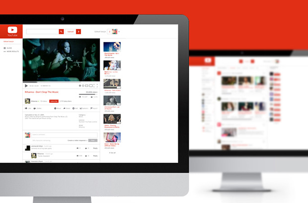
This YouTube redesign uses the same white and red color scheme but it is much more clean and organized than the original design. The right column for related videos and featured channels is a bit less in width but there is an additional column on the left which balances the overall design.
The homepage elements are well-organized and is based on flat design. Homepage displays featured videos and the friend's activity. Alike the current YouTube pagination where we have to click on the links, the concepts' pagination is based on Ajax loading where the next set of videos will load automatically. The right column displays featured channels.
The video pages are a bit similar to the original design. The video player is same as white theme and the all the control buttons are listed separately. The footer design is actually better than the original design.
