Facebook released Facebook Home launcher for Android in the starting of this year and it has evolved with the time now. There are a lot of other launchers on Play Store which enhances your phone's look but most of them have a standard layout and obey the Google's Official Holo Launcher. We have previously reviewed the most minimal and clean Atom Launcher for Android.
There are millions of Android Smartphone users all over the world and what I noticed is users are too confused on how to customize their phone. I have seen people using themes and widgets all over their launchers. I personally found that no matter the number of times you switch between launchers, you will get bored with the customizations in no time as most of them have same layout.

If you have used Apex Launcher and Nova Launcher, you will find them with no difference in the look and feel apart from the settings they provide. There are themes for these launchers which are basically icons sets and wallpapers.
If you feel like boring with your regular phone customizations then you should switch to Facebook Home.
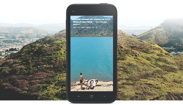
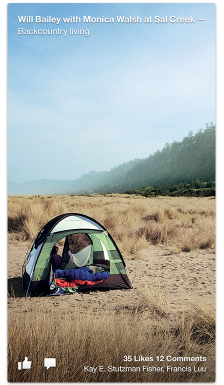
Facebook Home is very simple and light home launcher for Android phones which does nothing but aggregates your Facebook account's feed on your homescreen.
When Facebook Home was first released, it was available for some high-end phones only but it is now available for most of the devices and can be downloaded from the Google Play Store.

One of the best thing about Facebook Home is you will get to see all new updates from your feed and you can respond to them right from your phone's main screen and without opening any app or something. You will get all your notifications on the very first screen after pressing the power button. You will always get to see new updates from your circle which will never bore you. The launcher is just refreshing and clean.
With just a swipe, you can pull the app drawer which include the frequently used apps. You can always drag apps to this drawer from the list of all apps. The look of the app drawer was different when it was first unveiled by Facebook, but the new update made it better. Also, there were noticeable lags in the very first release while the new update made it faster and responsive.
I never wanted to use Facebook Home as I am not a power user but what made me use this launcher is it simplifies the way we use our launchers and it also improves our interaction and engagement. It is one of the unique android launchers you would want to stick to if you use it for sometime.